Redesigning Kidocode's Website and Learning Platform
- Role
- Head of Design
- Company
- Kidocode
- Year
- 2023
- Focus
- Product Design
- Web Design
- UX Research
- EdTech
Overview
I redesigned the website that brings families in and the learning platform students use every day. The platform changes lifted session length by 31%, cut trial class costs by ~50%, reduced task resubmissions by ~62% and cut parent complaints by ~58%.
Results
Kidocode teaches kids to code, and two products carry that experience: the website where parents decide whether to book a trial class, and the learning platform where students spend their time. After our rebrand, I led the redesign of both, applying the new identity and reworking the experience behind it using moderated user testing and feedback from students, trainers and parents.
Learning platform results
- +31% average session length, from clearer course navigation
- +17% student logins after 5 PM, from dark mode, which older students had asked for
- ~50% lower trial class time and cost, from a new onboarding flow
- ~62% fewer task revisions and resubmissions, from better task statuses, hints and task chat
- ~58% fewer parent complaints and discussion time, from progress reports, lesson summaries and leaderboards
Website
A new, community-led site built in Webflow to increase trial class signups and make our offering and "why" clear.
Several platform results mattered beyond engagement. Pandemic-era pressure meant we needed to scale with fewer trainer hours, and these changes reduced manual effort across trials, task review and parent support.
Team and scope
I led a team of 3–4 spanning design, marketing and business development, and owned creative and UX direction for both projects, from research through design and, for the website, build.
The Challenge
Problem
Two products that didn't reflect the company
The website had grown alongside the old identity. It was visually inconsistent and did not explain clearly what Kidocode offered, who it was for, or why it existed. It also hid the community and product work that made us credible to parents. Because the website is the main route into trial classes, those gaps had a direct business cost.
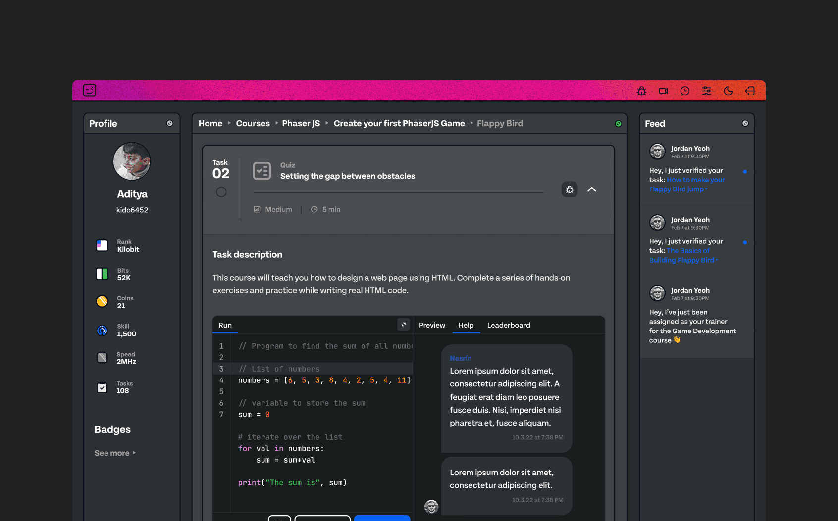
The learning platform's interface had not been updated since the company's founding. It was essentially unstyled Bootstrap components, and it did not reflect our mission of making learning engaging.
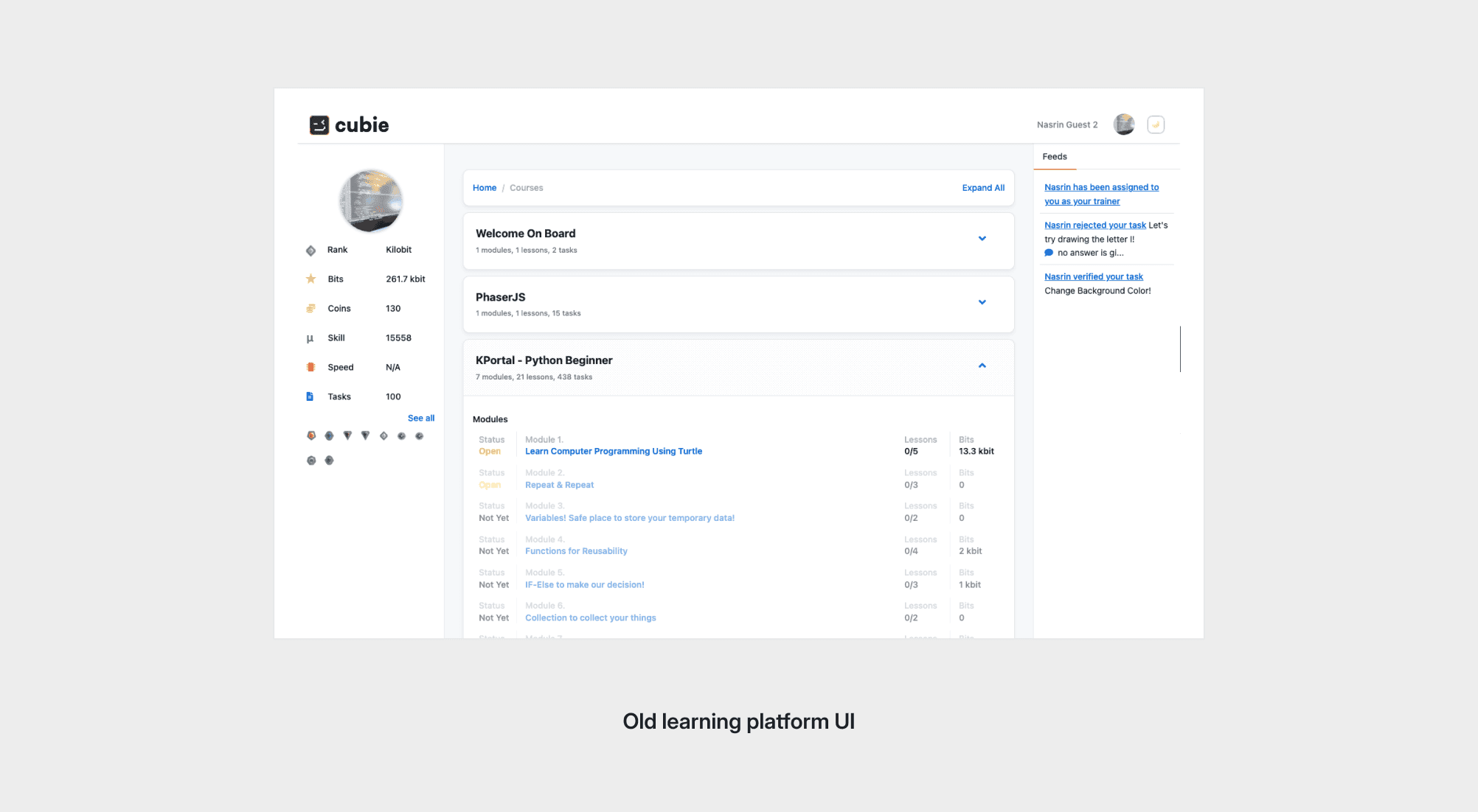
Beyond looks, the platform made it harder than necessary for students to see their progress, for trainers to review work, and for parents to follow how their child was doing. Trial classes also relied on physical, manual steps, which was costly after the pandemic.
Goals
Website
- Increase trial class signups
- Showcase our community and our product
- Make who we are and what we offer easy to see
- Make "our why" unmistakable
Learning platform
- Adopt the new visual language
- Improve onboarding, navigation and the learning experience
- Improve engagement metrics
- Make "our why" clear in the product
I set the website goals from customer and stakeholder research. For the platform, the direction was an OS-like environment where students can learn, play, build and interact with one another.
The Process
Website
Structure before pixels
To move quickly without sacrificing quality, I started with the information architecture. Mapping out the content blocks and how they flow gave us an approved structure to design against, and it avoided rounds of visual revisions on a flawed foundation.
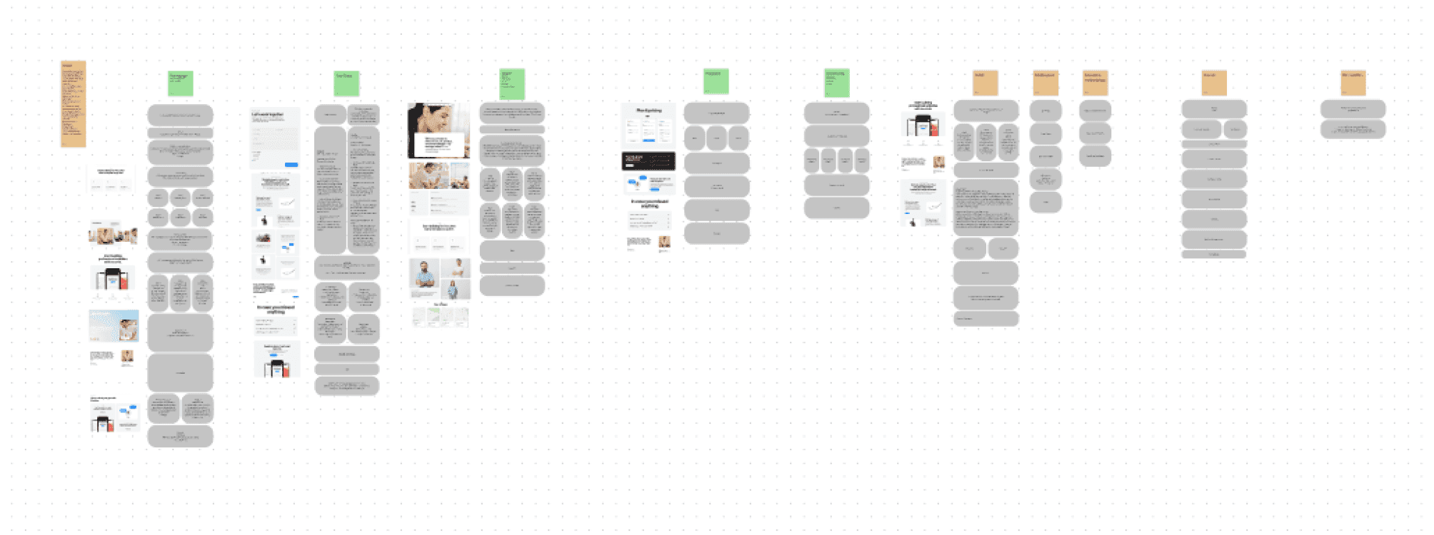
From structure to high fidelity
Once the structure was approved, I built high-fidelity designs for each page and worked with my team to bring them to life in Webflow. Designing and building in close step kept the final site faithful to the designs.
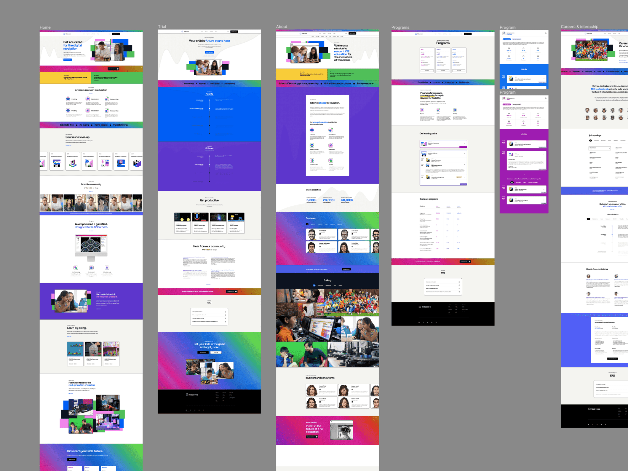
Putting the new type system to work
The hero section shows the clearest gain from the new brand. Pairing Space Grotesk with a single pixel-styled character, drawn from SF Pixelate, gave the headline a stronger hierarchy and a signature that is recognizably ours.
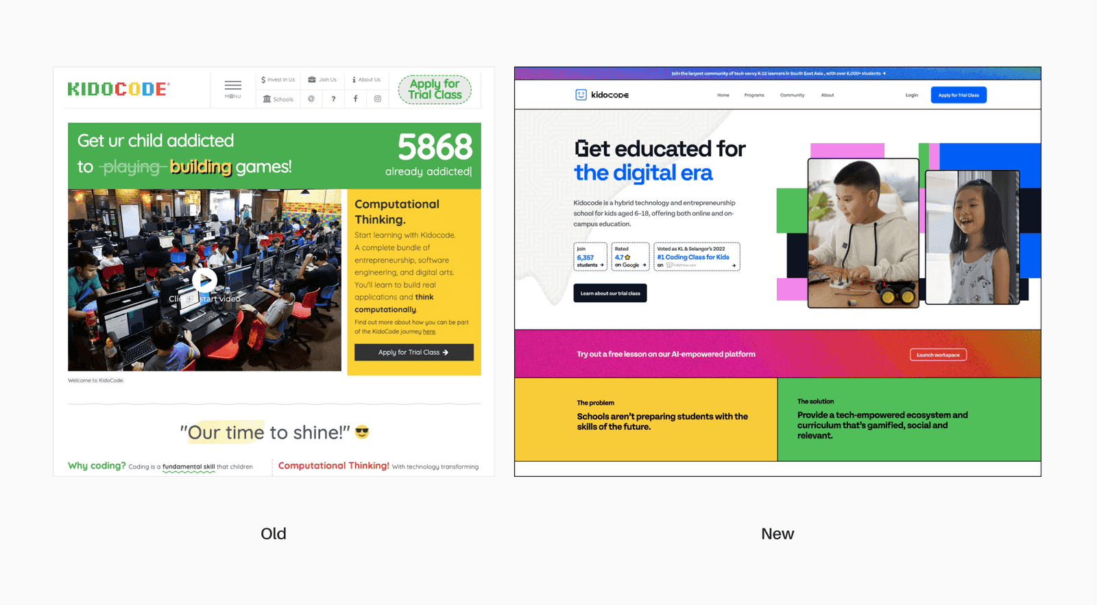
A site that shows who we are
The new site presents Kidocode's offering and community clearly, in one visual language from the first scroll to the last.
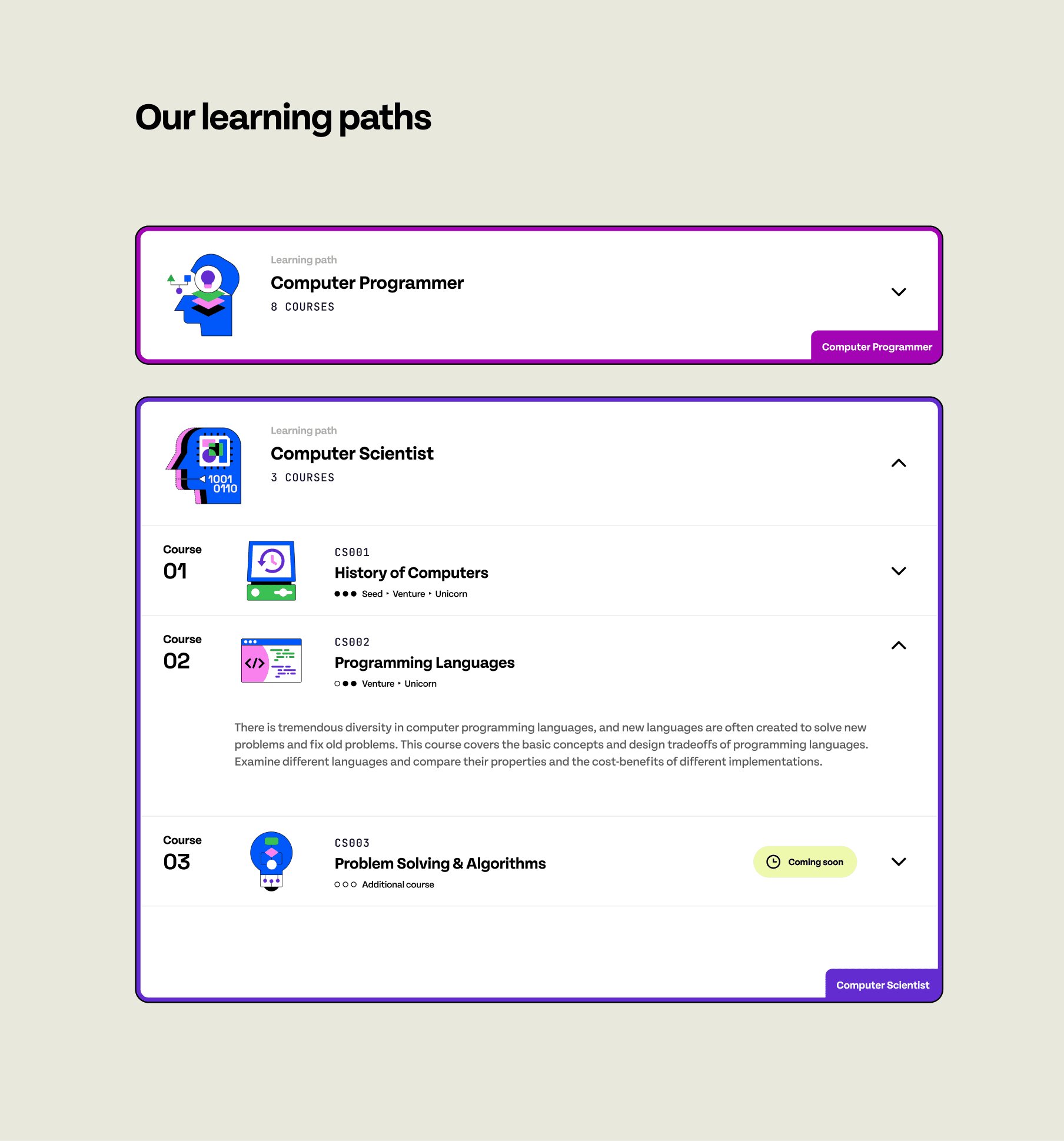
Learning paths make our programs easy to understand, so parents can see what their child could do with us.
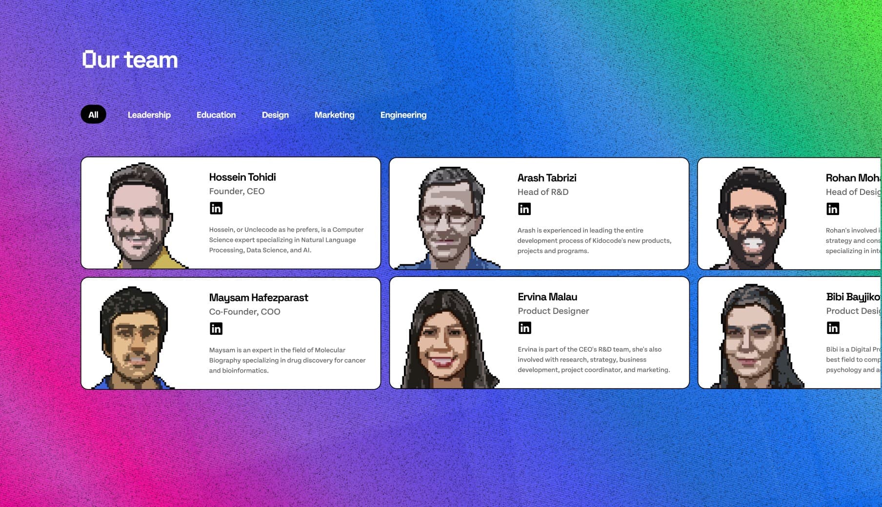
The team section puts the people behind Kidocode up front, which supports the trust families need before they commit to a trial.
Learning platform
Research first
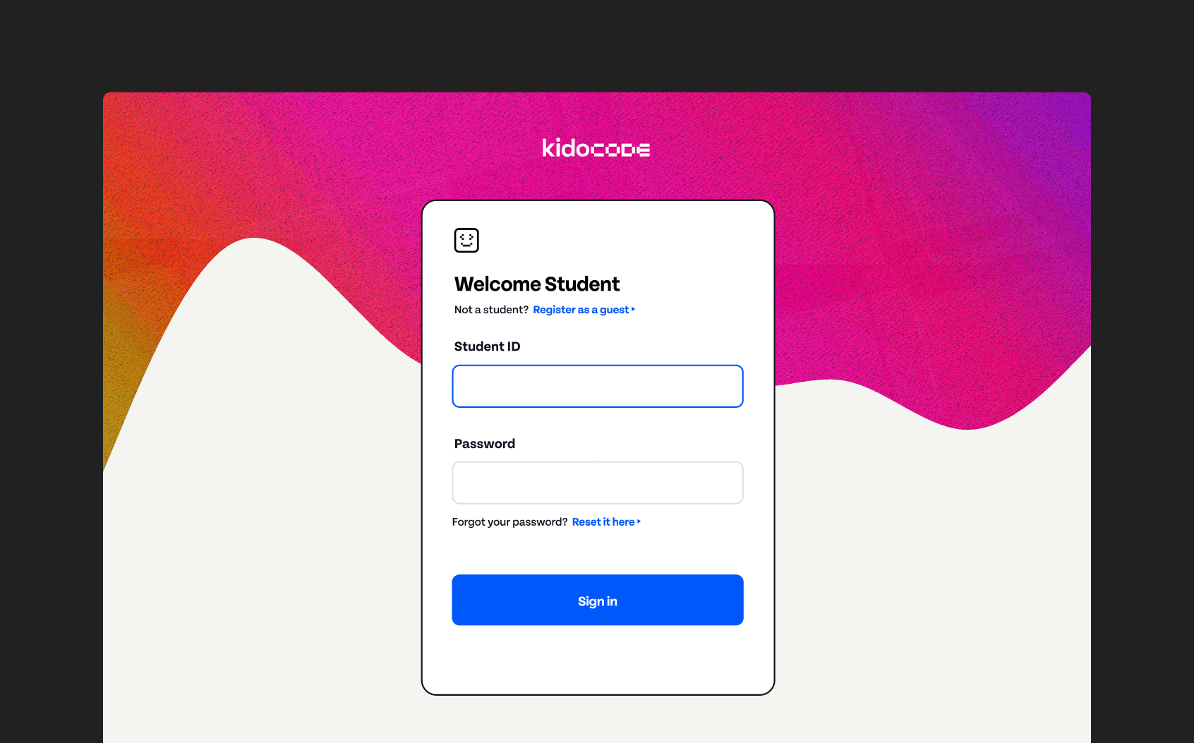
For the platform, I combined moderated user testing with feedback sessions with students and structured feedback from our parent community. Each change below came out of something we heard, not a visual preference.
Course navigation: show progress and reward
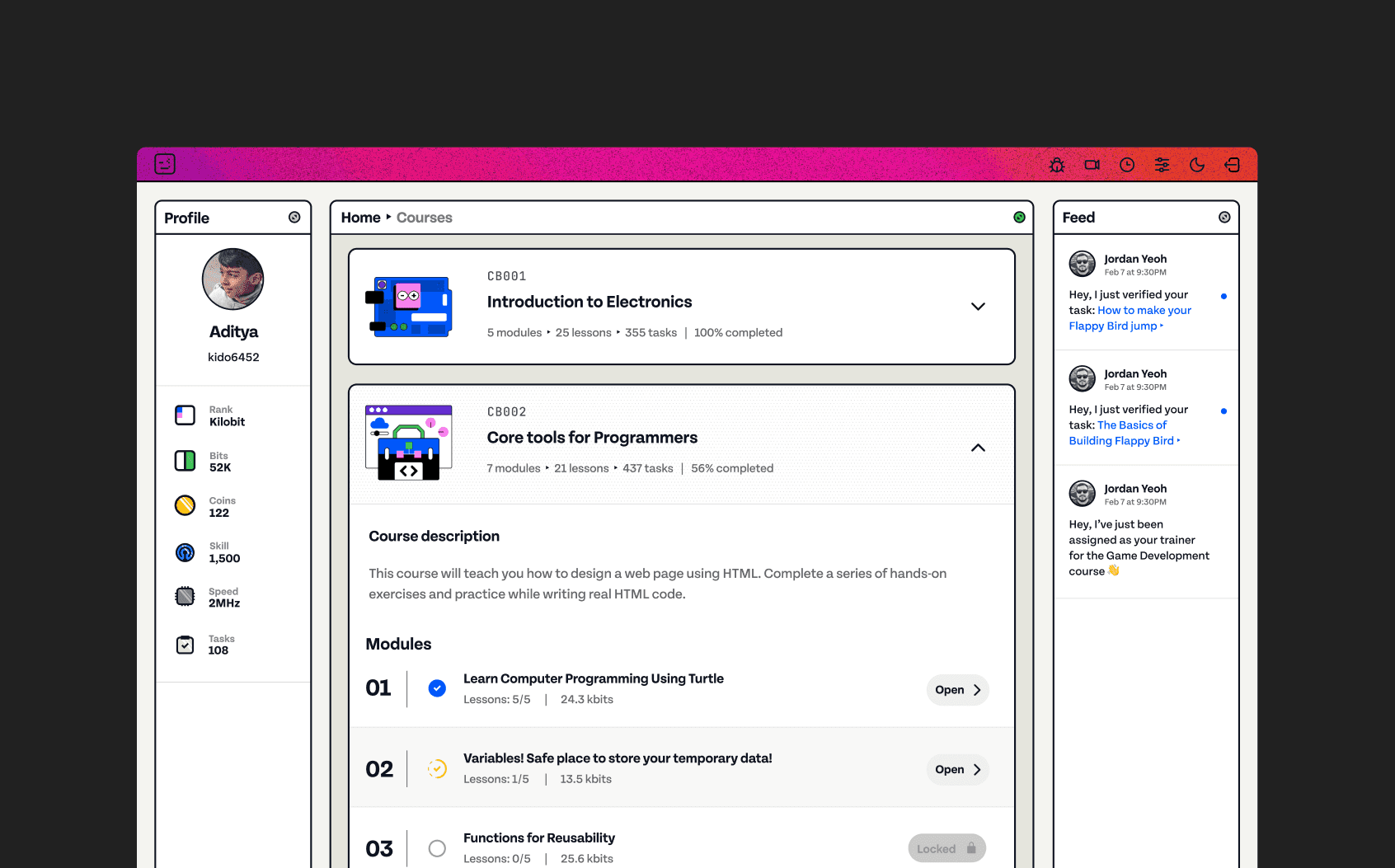
Students couldn't easily see what they had finished or how much remained. We rebuilt the course structure to show completed tasks, the percentage left and the points available for completing them.
Average session length rose 31%. In testing, students said that seeing what was left, and what they'd earn for finishing, made them more likely to keep going.
Onboarding: replace manual steps with a flow
We introduced an onboarding flow to replace many of the manual, physical parts of our trial class sessions. This reduced the time and cost of each trial by ~50%, which was a key part of streamlining operations during the pandemic.
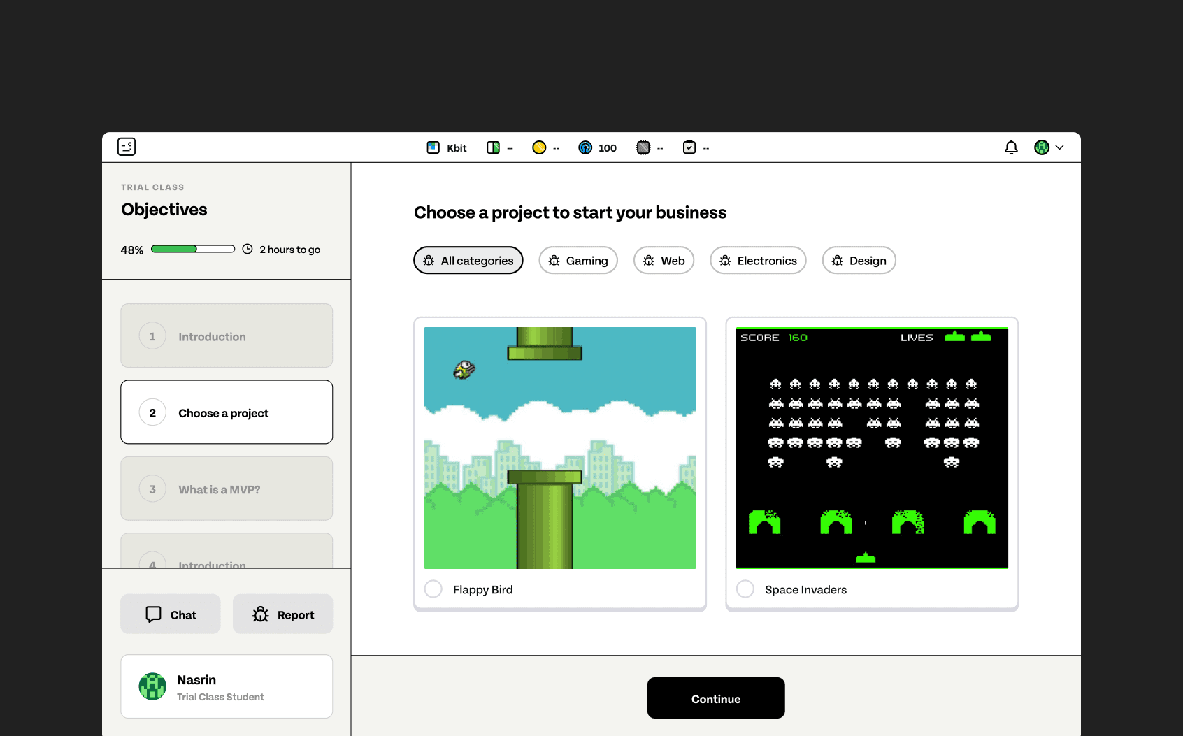
Dark mode: listening to older students
Older students repeatedly asked for dark mode in feedback sessions. After we shipped it, logins after 5 PM rose by an average of 17%, a clear sign that considering how and when students prefer to work increases engagement.
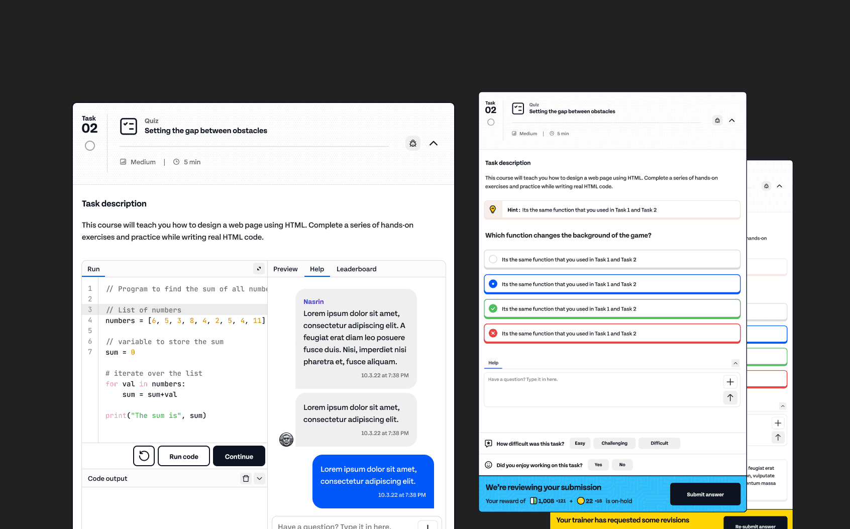
Tasks: fewer resubmissions, less manual review
We redesigned the task experience with clearer statuses, visible hints and task-specific chat. Task revisions and resubmissions fell by ~62%. More tasks were answered correctly and verified automatically, so trainers spent less time on manual intervention, which made the model easier to scale.
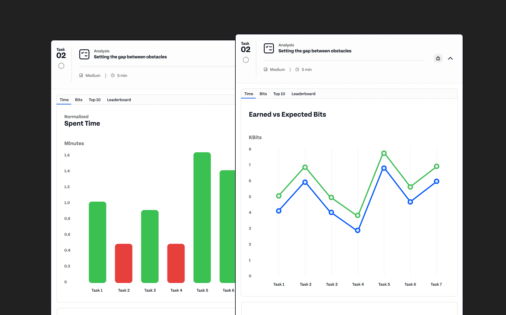
Progress reporting: giving parents confidence
Feedback from our parent community showed they wanted an easier way to see how their child was progressing. We added task-specific reports, lesson summaries and leaderboards so students, trainers and parents could all follow progress. Parent complaints and discussion time dropped by ~58%.
The Outcome
Impact
Brand work that moved business metrics
The launch was a milestone for the whole company. The website finally brought years of work on the curriculum, programs and community together in one public place, and the platform gave students a coherent, recognizable environment.
The platform redesign showed that brand and UX investment can change how students behave and how the business operates: students stayed longer, trials cost less, trainers spent less time on rework and parents raised fewer concerns.
Reflections
What I took from it
Starting the website with information architecture was the most valuable decision there. Agreeing on structure first let us move fast and keep stakeholders aligned. If I did it again, I would set trial signup baselines and instrument the funnel before launch, so the website's effect on conversion could be measured as clearly as the platform's.
On the platform, the wins didn't come from visual polish alone. They came from asking what students, trainers and parents were struggling with, and designing around it. Some of the biggest improvements, such as clearer task states and parent reports, were also the least glamorous.
At a startup where much of what gets designed never ships, shipping in increments let us build momentum and prove value one release at a time.